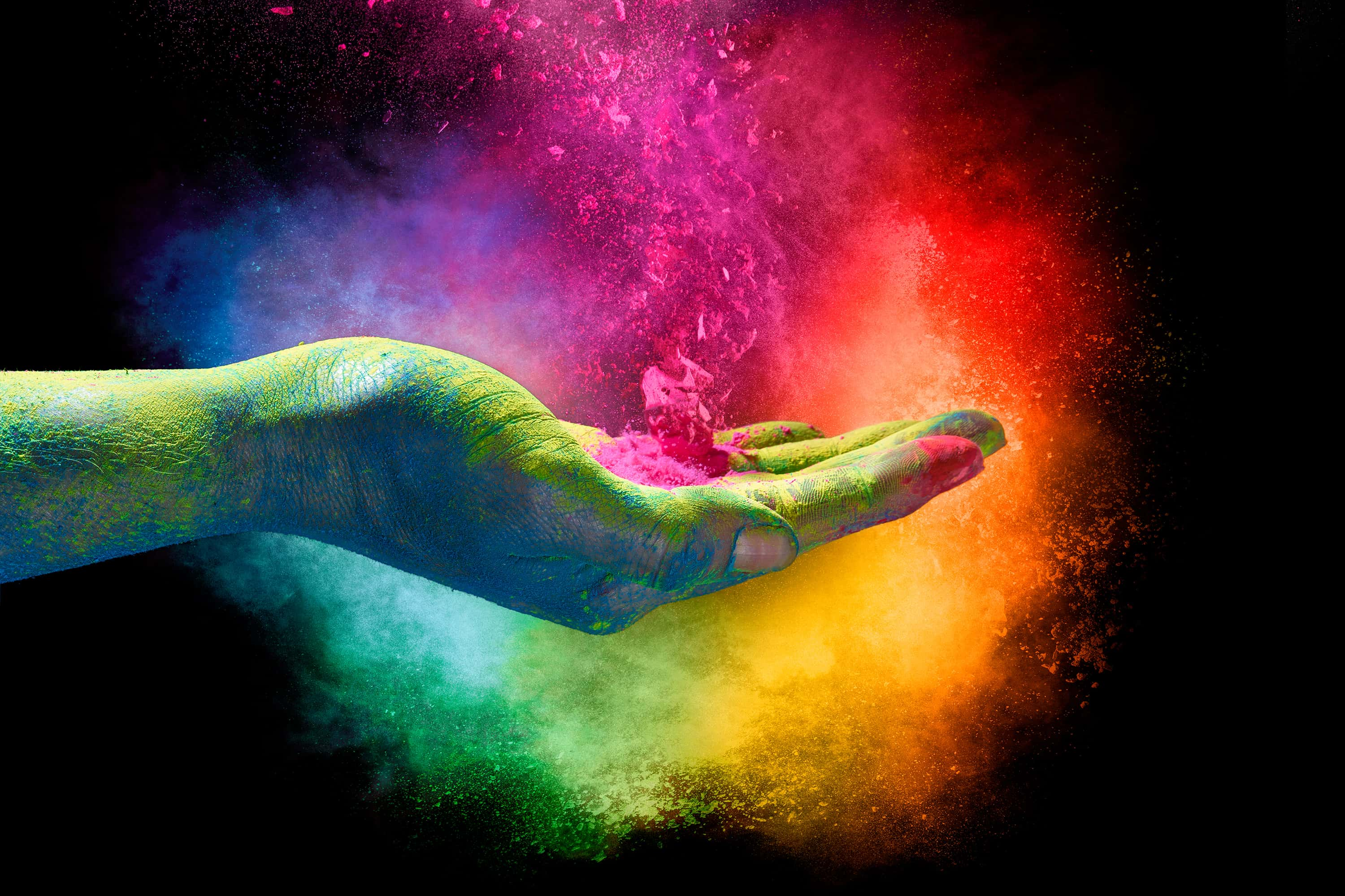
Color plays a part in our world that is taken for granted by most people—like breathing, it's likely that you don’t notice until you’re either forced to or until it’s taken away. But beyond what the eye sees when we look out the window—the grey or blue of the sky, the red brick of a building, the stippled green and pale yellow of a certain tree’s leaves and the dark, ashy brown of its trunk—there is a world of color that most of the general population is not privy to. How we experience color in the modern world is oftentimes actually a highly mediated experience, guided by forces that most people know little about.
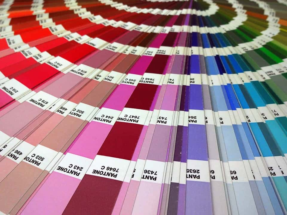
In the world of Pantone, the red you see on that brick building doesn’t actually look like Pantone Brick Red, which has a bit more violet in it. Depending on the age of the brick, it might read more as Chili Oil, Red Ochre, or even Redwood. Even those of us outside the world of art and design have likely heard of Pantone, although we might be hard-pressed to actually define what exactly it is they do. Pantone is just one corporation that, essentially, owns colors.
 Shutterstock
To be more precise, they own a proprietary color space—proprietary as in patented, as in, you must pay a fee to the Pantone corporation in order to use said color space, and color space as in a system of organizing colors that ensures reproducibility. That means that the ink for a specific shade of Pantone purple used in a magazine ad printed in New York City in 1998 will look the same to the viewer when the same purple is used for a Berlin museum’s website in 2008 or on a skirt made by a designer in Tokyo in 2018—as long as they’ve all selected the same Pantone swatch.
The Pantone color space, or the Pantone Matching System® as it's known, was born in the ‘50s and ‘60s in the world of advertising. Let your head be filled with visions of a Don Draper-esque figure working on a “Pass the Heinz”-ish ad campaign, knowing that the print ads in Delaware, Kentucky, and Vermont all have to feature the same shade of red for the iconic bottle of ketchup. If the dyes aren’t calibrated correctly, one version may be tinged blue, and look unnatural—and therefore, unappetizing. Another might have a yellow or brownish cast, and look rotten—and therefore, unappetizing (and let us never speak of the purple Heinz debacle of 2000 after this precise moment). In 1956, an ad agency called M & J Levine Advertising hired a recent graduate as a part-time employee and he set about creating a color system out of the pigments and inks already used by the company. By 1962, that employee, Lawrence Herbert, purchased the ink and printing division and renamed it Pantone.
While there are other color spaces in use, proprietary and otherwise, Pantone has come to be the authority. This is not just because of the Matching System®; it also has to do with the Pantone Color Institute—no, it’s not where color scientists go to learn how to mix Fiery Red and Imperial Blue to make Patrician Purple. The Color Institute, created in 1986, does color consulting and trend forecasting. As an offshoot, in 2000, Pantone began publishing and publicizing the Color of the Year. So not only does Pantone own a formula for that particular shade of pink you saw everywhere last year or the year before—Rose Quartz (2016 Color of the Year, a title shared with Serenity, a pale blue)—it’s the driving force behind its ubiquity.
 Wikimedia Commons
It’s normal to feel a little bit uncomfortable once you realize the role that a large corporation plays in the things we see and interact with every day, and perhaps even very uncomfortable regarding the part it plays in shaping our personal tastes and preferences. After all, color seems like something so natural, almost primal—think of the way that we relate certain colors with emotions. Red signifies passion, blue means tranquility or sadness, and white conveys purity. In a way, it feels almost as if our emotions are being unconsciously manipulated by these nefarious-seeming trend forecasters.
Long before color was the dominion of advertisers, it was artists (along with a few scientists and philosophers thrown in for good measure) who taught us much of what we know about color. The tradition of color theory—and with it, familiar concepts like primary and secondary colors, complementary colors, and color temperature—began with Renaissance artists like Leone Battista Alberti and Leonardo da Vinci, and continued with the Bauhaus and Josef Albers. After all, artists–painters in particular—spend countless hours mixing pigments together. Artists have an immeasurably close relationship with color that few of us could hope to understand, and with any close relationship comes heightened emotions.
The relationship of art and commerce has always been fraught, and with the subject of color being one that can be so emotional, there’s bound to be fireworks. In recent years, the contemporary artist Anish Kapoor, perhaps best known for his large “Cloud Gate” sculpture in Chicago’s Millenium Park (AKA the Bean), has stirred controversy and backlash over his own attempts to exclusively license colors for use in his own work.
 Flickr
Kapoor isn’t the first—and likely won't be the last—artist to tie his name to a color. Yves Klein had been using an ultramarine blue in his works for years before he collaborated with a paint supplier to create International Klein Blue (IKB)—a shade of ultramarine notable for the matte finish which makes it appear eye-piercingly intense. By copyrighting IKB, any use of IKB became synonymous with his work, essentially removing the hand of the artist from the equation. This was embodied most infamously in a series of artworks where nude female models would be covered in the color and laid down on or dragged across the canvas by Klein; in some cases, he would direct the models’ movements across the canvas remotely.
Vantablack is a material composed of carbon nanotubes created by the UK’s Surrey NanoSystems that can serve a variety of engineering, technological, and military applications, but its transformation into spray paint is what has garnered it the most media attention. What makes it so special? Vantablack absorbs light at a much higher rate than any other shade of black, making it the “blackest” black out there. To borrow a joke made by many others, how much more black could it be? None more black. It’s an amazing effect—imagine any black object, say a chair, sitting in front of a white wall. You might make out the bevel on the edges of the legs, and maybe a reflection from overhead light on the seat. Not so with Vantablack. It would appear as a complete void of light, like a chair-shaped hole punched in the fabric of reality.
One of the paint versions of Vantablack, Vantablack S-VIS, has been exclusively licensed to Anish Kapoor for use in artistic projects, and Kapoor’s act of essentially cutting off other artists at the pass has managed to infuriate many—even though it was Surrey NanoSystems that chose to work with Kapoor over other artists. Regardless, the blame and ensuing reactions were directed solely at Kapoor. It was the biggest color scandal since—gasp—“The Dress.”
 Wikimedia Commons Vantablack
In response to Kapoor's monopoly on a color, an artist by the name of Stuart Semple created a pink counterpart to Vantablack, claiming it was the pinkest pink and putting it up for sale on his website for anyone to buy—that is, anyone except Kapoor. At checkout, buyers were required to legally declare that they weren’t buying the color on behalf of Kapoor. Kapoor found a way to acquire some anyway and posted a cheeky Instagram with it. Then, Semple continued the feud by creating multiple versions of what he called Better Black—not as dark as Vantablack, but affordable and accessible. An organization called Nanolab has also created a nanotube-based black paint called Singularity Black in retaliation to Kapoor’s partnership with Surrey NanoSystems. For their part, Surrey NanoSystems defended the decision, claiming that they licensed a technology, not a color, to Kapoor.
Artists and designers (graphic, fashion, floral, furniture, and so on and so on) are probably the two groups who concern themselves with color the most in the world. The latter group operates firmly in the world of commerce, but the uneasy relationship between art and commerce defines the dramatic way that artists have dealt with this idea of copyright and color. The reaction to Kapoor’s exclusivity agreement with the makers of Vantablack raises the hackles of other artists and critics for one major reason—it makes the color inaccessible to others. And as for us plebes? We can feel like we’re surrounded by color, but in the modern world, scuffles like these have taught us that some colors may always remain beyond our grasp.
Sources: 1, 2, 3, 4, 5, 6, 7, 8, 9, 10, 11


